
The Maw of Chaos - why time forecasting is so challenging?
Introduction
I promised to myself not to write about Covid-19.
However, with my recent inclination in going back to fundamentals and revisiting some of the more interesting topics in mathematics, I thought it would be fun and useful to explain why forecasting a time series (e.g. a disease progression) is so challenging. More precisely, I want to explain why making such simulations can be really be hard sometimes by showing how things work at the fundamental level.
We will start with some basic equations and discuss the main challenges that relate to data and building models. Then, we will move on to a more intricate mathematical phenomenon known as chaos. Just like in Thief: The Dark Project (one of my old favorites) we will descent into it gradually, but this time, we will be equipped with python. ;)
The simplest model
Exponential growth
Without losing generality, let’s associate with the number of people that contracted a disease at a given time step . The simples model to determine progression is the following update rule:
It is a simple recursive formula that doubles the value of every time it is applied. Here is just a proportionality constant that tells the rate at which the spread takes place.
Since time is continuous, it makes sense to consider a time-dependent value . Furthermore, it also makes sense to interpret it as the fraction of the population rather than an absolute quantity. This way, we can reformulate the problem as a simple first-order differential equation (ODE):
with .
The solution to this equation is represented with the classic exponential function
where is the so-called initial condition.
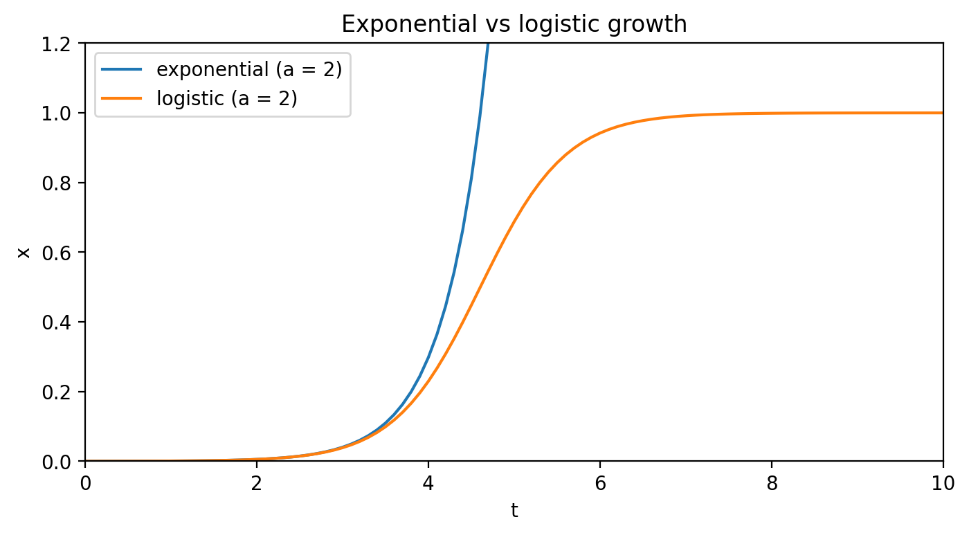
Its form is exactly what stands behind dramatic growth. However, this function is a poor model when begins to grow too large. After all, as we agreed to use to describe the fraction of the population, it cannot rise beyond 1. At some point, it has to slow down, also because if a person that is infected only meets infected people no more new infections take place.
Logistic growth
It seems a natural step to account for this “halting” mechanism when defining our model. How about the following model?
This formula defines the logistic growth. Let’s consider its properties. Initially, when is small, and, the growth is exponential. However, as quickly as approaches 0.5, the begins to damp the growth, bringing it to a complete stop for .
Things get complicated…
The logistic growth looks can be accepted. We like it, because it is simple to understand, captures some of the reality, and gives us hope that as soon as we approach the “tipping point” (which is in this case), we can prevent the exponential growth and gradually slow down the whole thing. Perhaps we just need to parametrize the logistic update rule here and there and it will surely do us a favor. We know it can buy us precious time to, say the least.
Unfortunately, this is where things turn into difficult.
Data-related problems
The common starting point in such simulations (e.g. here or here) is to first, modify the logistic growth equation to capture more reality, find the data (e.g. number of cases occurring each day in some country), finally fit the data into the analytical solution (if exists) or integrate it numerically using the data to fine-tune it. If a solution captures the data well, we can make predictions or carry on with further “what-if” analytics.
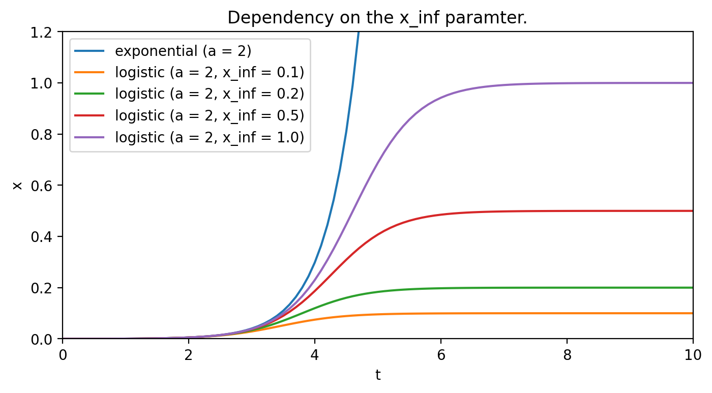
It sounds simple, but the bad news is that most parameters are challenging to estimate. For example, let’s modify the equation slightly, by adding coefficient (just like in here) to account for the fact that perhaps not everybody will contract the disease. The equation will then become the following:
The coefficient itself denotes the ultimate fraction of the population that will get infected. Although that is an unknown, one can try to estimate it by comparing the deviation of the parametrized logistic curves from the exponential curve. Figure 2. shows the impact of this parameter.
As most data is noisy, the noise can easily translate into wrong estimates of some coefficients. In the case of differential equations, these small changes can further get amplify which may lead to bold misestimations (more on that later).
Still, the noise on the data is only a part of the bigger picture…
Model-related problems
Adding the parameter shows a step in the right direction to capture more reality. However, it does not capture all of it. People move, get sick, some recover, some get sick again, some die, and some get born. Some also die because of completely unrelated reasons.
The whole population is a dynamic entity and that should translate to a new equation. While certainly not all the processes need to be factored in, to decide which processes do matter and which don’t as well as how they should be accounted for presents itself even with a larger challenge.
Let’s take a look at the following example: data for Poland. Considering the first 100 days, it may seem evident that the disease progression can indeed be expressed with a solution to the modified logistic growth equation:
1
2
3
4
5
6
7
8
9
10
11
12
13
14
15
16
import pandas as pd
import numpy as np
from scipy.optimize import curve_fit


df = pd.read_csv('./poldata.csv').set_index('day')
ddf = df.head(100)

t = np.linspace(0.0, 10.0, num=101)

def logistic(t, a, x0, xi):
    return x0 * xi * np.exp(a * t) / (xi + x0 * (np.exp(a * t) - 1))


(*params,) = curve_fit(logistic, t[1:], ddf['cases'].to_numpy())[0]
solution = logistic(t, *params)
Figure 3. shows the result.
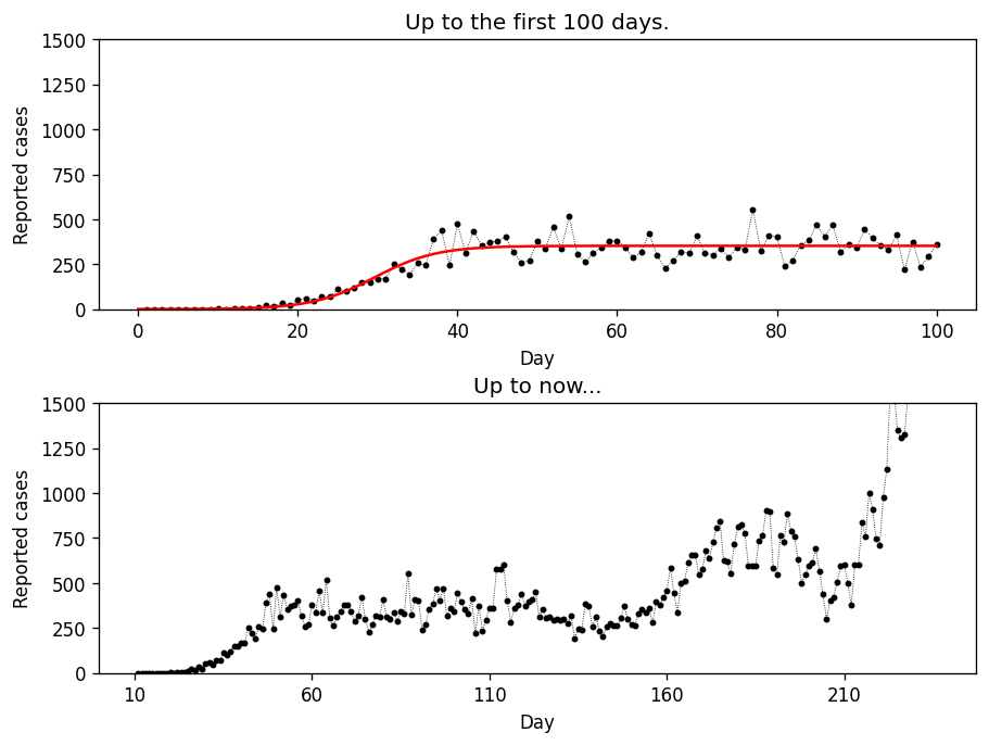
Truth is that after the first 100 days, people seem to have changed their attitude drastically. Speaking math, not only our equation does not capture several, possibly important contributing factors (e.g. people recovering or getting re-infected), but also the constants (e.g. ) are not really constants.
Consequently, as the data seem to reflect some trend (different than the logistic, but a trend nevertheless), it makes sense to blame the model for being too simple.
True. A situation like this may, indeed, give us hope that with the right ingredients, it should be possible to construct the necessary equation, which once solved, can be used for predictions.
Unfortunately, there one last problem that remains that appears to be mathematics itself.
Chaos
It’s chaos. Without randomness, noisy data, or a miscalibrated equation, chaos is what may turn all predictions into complete nonsense. It is a purely mathematical phenomenon, which has its origins in, well, numbers.
For simplicity, let’s go back to the pure logistic growth update rule . Let us also write the code that would apply this rule recursively. It will make it easier to visualize later.
1
2
3
4
5
6
7
8
9
10
11
12
13
14
from functools import lru_cache

def logistic_growth(x, a=2.0):
    return a * x * (1 - x)


@lru_cache(100)
def update(x_init, i, rule=logistic_growth):
    x = rule(x_init)
    i -= 1
    if i == 0:
        return x
    else:
        return update(x, i, rule=rule)
Cobweb plot
With this piece of code, we can investigate the consequences of initializing the solution using the so-called cobweb plot. The plot is constructed by sketching both the update rule and a diagonal line . Then, by initializing with some number, we trace it by subsequently applying the rule and feeding the output back to the input. Visually, this translates to bouncing the point off the curves (figure 4.).
1
2
3
4
5
6
7
8
9
10
11
12
13
14
15
16
17
18
19
20
21
22
23
24
25
26
27
28
29
30
31
32
33
34
35
from functools import partial

def cobweb_plot(ax, x0_init, a, rule=logistic_growth, max_iter=10,
    xlim=(0, 1), ylim=(0, 1)):

    x = np.linspace(xlim[0], xlim[1], num=101)
    update_rule = partial(rule, a=a)

    ax.plot(x, update_rule(x), 'b')
    ax.plot(x, x, color='k')

    x0, x1 = x0_init, update(x0_init, 1, rule=update_rule)
    y0, y1 = 0.0, update(x0_init, 1, rule=update_rule)

    ax.plot((x0, x0), (0, y1), 'r', lw=0.5)

    x0, x1 = x0_init, update(x0_init, 1, rule=update_rule)
    y0, y1 = 0.0, update(x0_init, 1, rule=update_rule)

    for i in range(1, max_iter):
        y1 = update(x0_init, i, rule=update_rule)
        ax.plot((x0, x1), (x1, x1), 'g', lw=0.5)
        ax.plot((x1, x1), (x1, y1), 'g', lw=0.5)
        x0, x1 = x1, y1

    ax.set_xlabel('x')
    ax.set_ylabel(f'{a} x(1 - x)')
    ax.set_title(f'Logistic growth progression, x0={x0_init}')
    ax.set_xlim(xlim)
    ax.set_ylim(ylim)


fig, axs = plt.subplots(2, 2, figsize=(10, 10), dpi=100)
for ax, x_init in zip(axs.flatten(), (0.11, 0.25, 0.66, 0.88)):
    cobweb_plot(ax, x_init, 2.0)
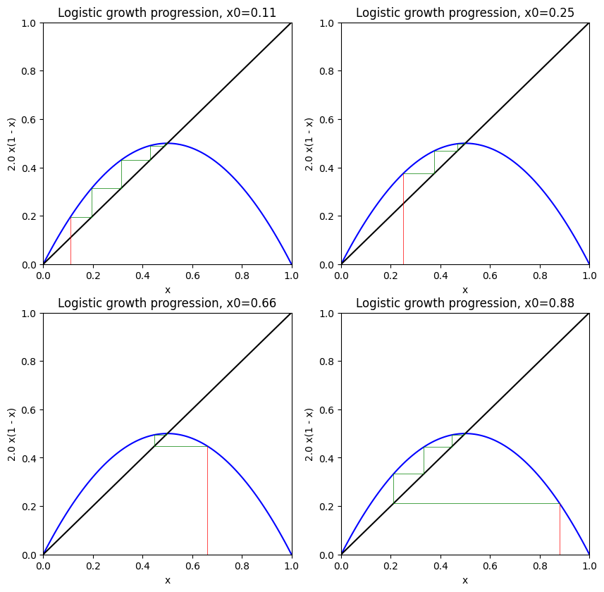
Points where are called fixed points. They are important, as they contain infomration about the whole system. Here (figure 4.), it is evident that is a particular fixed point, which tends to attract the solution. More formally, it is called a stable fixed point, because no matter how we initialize the solution, will eventually stabilize at 0.5.
Not every x is “attractive”
The logistic rule is so simple that one would not expect that anything could go wrong with it. We know that the coefficient is what dictates the rate of the spread (often referred to as in the literature). Now, let’s change it to some different values.
1
2
3
4
5
6
7
fig, axs = plt.subplots(2, 2, figsize=(10, 10), dpi=100)

axs = axs.flatten()
cobweb_plot(axs[0], 0.12, 3.31, maxiter=150)
cobweb_plot(axs[1], 0.62, 3.31, maxiter=150)
cobweb_plot(axs[2], 0.12, 3.51, maxiter=150)
cobweb_plot(axs[3], 0.12, 3.99, maxiter=150)
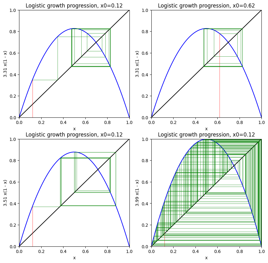
As we can see in figure 5., choosing a slightly higher value for the replication rate , we obtain two fixed points. The system becomes bi-stable and as , the solution flips interchangeably between and .
Increasing the rate even further , we get a 4-fold periodicity. Finally, for even higher , no point seems to attract the solution anymore. It becomes unstable, where a slight change to the initial value results in a completely different path. It is literally the Butterfly Effect.
Note that this is not randomness, as our calculations are completely deterministic. However, it is due to the instability just mentioned, that in practice even for a perfect dataset and a well-designed equation, we may face a situation where it will be impossible to make any long-term predictions.
This is just… mathematics.
The bifurcation
Before we conclude on this part, it may be fun to visualize one more interesting graph.
1
2
3
4
5
6
7
8
9
10
11
12
13
N_SAMPLES = 200


def get_fixed_point(x_init, a):
    return update(x_init, 100, rule=partial(logistic_growth, a=a))

a_values = np.tile(np.linspace(0.0, 4.0, num=200000) \
    .reshape(-1, 1), N_SAMPLES)
df = pd.DataFrame(a_values) \
    .applymap(lambda a: (np.random.random(), a)) \
    .applymap(lambda c: get_fixed_point(*c))

df = df.unstack().xs(1)
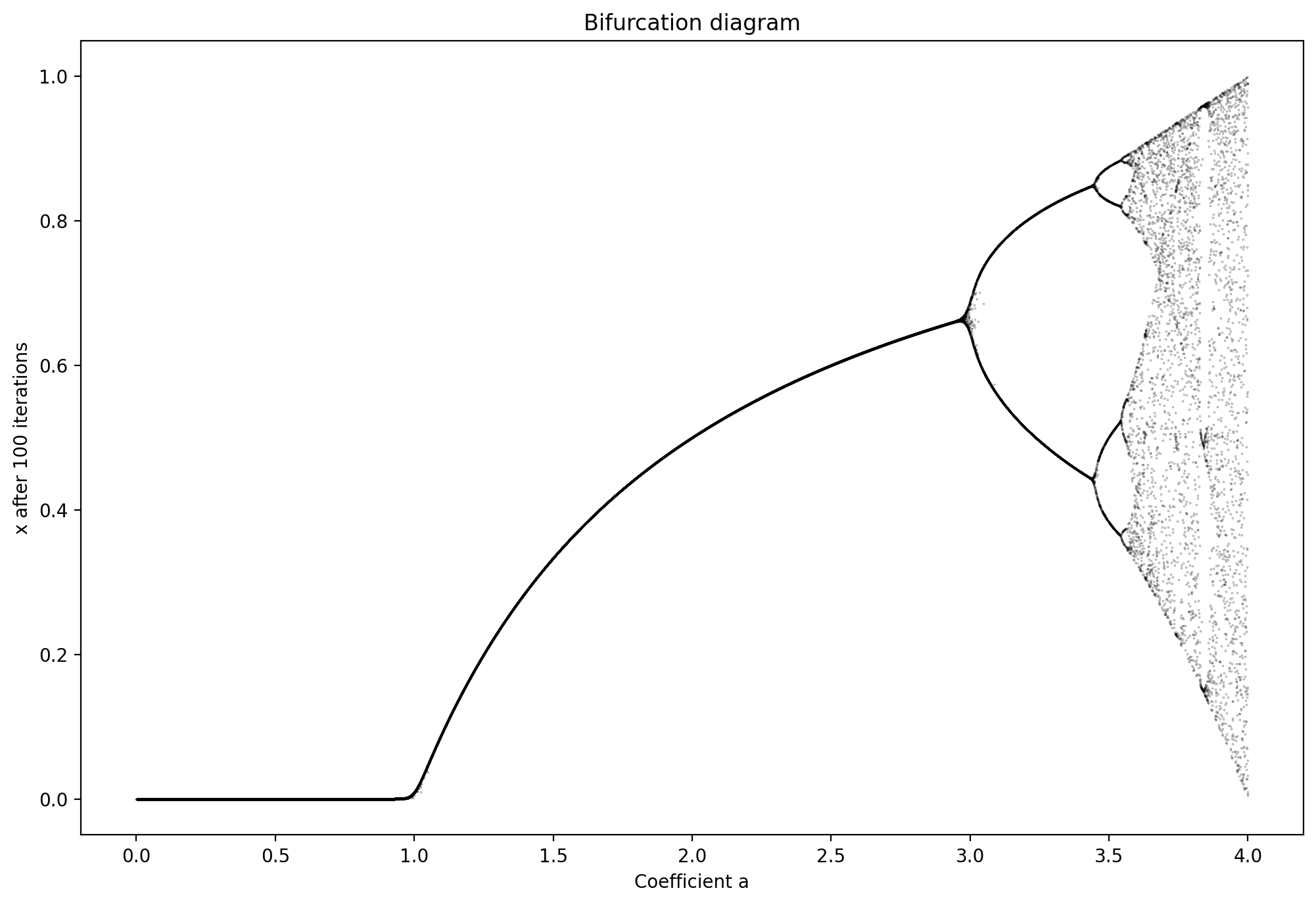
Figure 6. shows the so-called bifurcation diagram, which shows different values as a function of . We can see that for as long as , the ultimate fraction of the infected will get down to zero. For , it will be non-zero, but at least it has one solution. However, as increases further, the ultimate behavior of the system becomes more and more unpredictable, even if is estimated precisely. The system is simply too sensitive to small changes and thus cannot be trusted.
Conclusion
Creating mathematical models is no easy task. We have seen the three main types of challenges that people can face, from which the last one seems like it can be the mathematics itself playing tricks on us. Still, many find it fascinating that even simple equations can exhibit such rich behavior.
From the practical perspective, predictive models are often “powered” with the mathematics that involves update rules of some sort. Even if they are not directly based on differential equations, it is often worth considering if solutions produced by these models are stable. As we have seen, even with simple rules the long-term effects of applying them consecutively may lead it straight into the Maw of Chaos.